
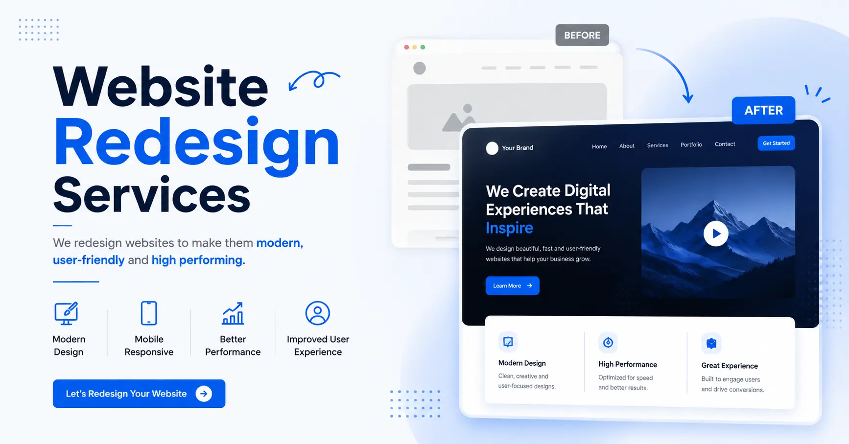
Responsive Website Design In today’s digital era, users access websites from a wide range of devices, including smartphones, tablets, laptops, and desktops. This shift in user behavior has made responsive website design a necessity rather than an option.
A responsive website automatically adapts its layout, images, and functionality to fit different screen sizes. This ensures a seamless experience for users, regardless of the device they are using.
In this comprehensive guide, you will learn everything about responsive website design, including its benefits, features, best practices, and advanced strategies that most competitors fail to cover.
What Is Responsive Website Design?
Responsive website design is an approach to web design that ensures a website adjusts dynamically to different screen sizes and devices.
Instead of creating separate websites for mobile and desktop, responsive design uses flexible layouts, grids, and media queries to deliver a consistent experience across all devices.
This means:
- Content automatically resizes
- Images scale properly
- Navigation adapts to smaller screens
- Users can interact easily without zooming or scrolling excessively
Why Responsive Design Is Important
The importance of responsive design has increased significantly due to the rise in mobile usage.
Key Reasons:
- Over half of web traffic comes from mobile devices
- Google prioritizes mobile-friendly websites in rankings
- Users expect fast and seamless experiences
A website that is not responsive risks losing traffic, engagement, and potential customers.
Benefits of Responsive Website Design
Improved User Experience
A responsive website ensures users can navigate easily on any device. This leads to higher satisfaction and engagement.
Better SEO Performance
Google uses mobile-first indexing, meaning it primarily evaluates the mobile version of your site for ranking.
Responsive design helps:
- Improve rankings
- Increase visibility
- Drive organic traffic
Faster Loading Speed
Responsive websites are optimized for performance, reducing loading times and improving user retention.
Cost-Effective Solution
Instead of maintaining multiple versions of a website, responsive design allows you to manage a single site.
Higher Conversion Rates
A seamless user experience leads to better conversions, whether it’s sales, sign-ups, or inquiries.
Key Features of Responsive Website Design
Flexible Grid Layouts
Content is arranged in a grid that adjusts based on screen size.
Responsive Images
Images resize automatically to fit different devices.
Media Queries
CSS techniques that apply styles based on device characteristics.
Mobile-Friendly Navigation
Menus adapt into simpler formats like hamburger menus on smaller screens.
Touch-Friendly Elements
Buttons and links are optimized for touch interactions.
Responsive Design vs Adaptive Design
| Feature | Responsive Design | Adaptive Design |
|---|---|---|
| Flexibility | High | Moderate |
| Development Approach | Fluid layouts | Fixed layouts |
| User Experience | Consistent | Device-specific |
| Maintenance | Easier | More complex |
Best Practices for Responsive Website Design
Mobile-First Approach
Design your website for mobile devices first, then scale up for larger screens.
Optimize Images
Use compressed images and modern formats to improve loading speed.
Use Scalable Fonts
Ensure text is readable on all screen sizes.
Simplify Navigation
Keep menus simple and easy to use on smaller screens.
Test Across Devices
Regular testing ensures your website works smoothly on all devices.
Advanced Strategies Competitors Miss
To outperform competitors, you need to go beyond basic responsive design.
Core Web Vitals Optimization
Focus on:
- Largest Contentful Paint (LCP)
- First Input Delay (FID)
- Cumulative Layout Shift (CLS)
Improving these metrics boosts SEO and user experience.
Progressive Web Apps (PWAs)
PWAs combine the best of websites and mobile apps, offering:
- Offline access
- Faster loading
- App-like experience
Adaptive Content Delivery
Serve different content based on user behavior and device type.
AI-Based Personalization
Use AI to deliver personalized experiences for users.
Advanced Performance Optimization
Implement:
- Lazy loading
- Code splitting
- CDN integration
Common Mistakes to Avoid
Avoid these common errors:
- Ignoring mobile users
- Using large, unoptimized images
- Poor navigation design
- Overloading the website with features
- Not testing on multiple devices
These mistakes can negatively impact performance and user experience.
Tools for Responsive Website Design
Here are some tools that can help:
- Google Mobile-Friendly Test
- Chrome DevTools
- Bootstrap framework
- Figma for design
- PageSpeed Insights
These tools help ensure your website is optimized and responsive.
How to Choose a Responsive Web Design Company
Check Portfolio
Look for responsive websites they have built.
Evaluate Expertise
Ensure knowledge of modern frameworks and design techniques.
Read Reviews
Client feedback helps assess reliability.
Ask About Testing
Ensure they test websites on multiple devices.
Understand Their Process
A clear workflow ensures better results.
Future Trends in Responsive Website Design
Stay ahead of competitors by following these trends:
- Voice search optimization
- Dark mode design
- Micro-interactions
- Motion UI
- AI-driven design
Final Thoughts
Responsive website design is essential for businesses that want to succeed in today’s digital landscape. It ensures that your website delivers a seamless experience across all devices, improving user satisfaction and engagement. A well-designed responsive website provides better user experience, higher search engine rankings, faster performance, increased conversions, and long-term scalability, making it a key factor in building a strong online presence.
More importantly, responsive design helps businesses stay competitive by adapting to changing user behaviors and technological advancements. Investing in responsive website design is not just about making your site look good on different devices; it is about creating a powerful digital experience that drives results, enhances customer interaction, and supports long-term business growth.


